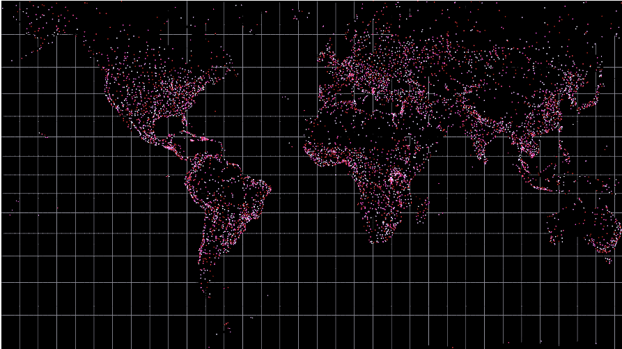
A dotted map of world cities

A map of all the power plants in the US. The circles are sized by their output and colors represent the type
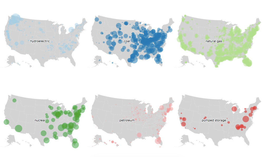
Broken down by type of power plants as small multiples of the map above

An election choropleth map. Color relates to who was voted for and opacity represents how many people are in that county
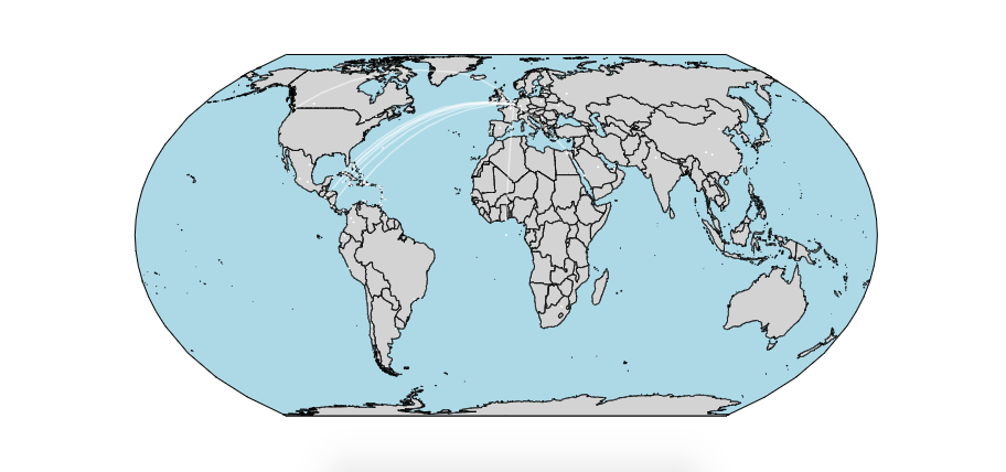
Map of airports to which you can fly non-stop from JFK. Used geoEqualEarth projection